Attack Graphs - How to create and present them
Conceptual Attack Graphs
One question that I have gotten a few times about “Cybersecurity Attacks - Red Team Strategies” is around the conceptual attack graphs in “Chapter 3, Measuring an Offensive Security Program”. Specifically, how I create them.
In this post I will briefly go over some of the reasons for creating them, and also how I create them and share a template for others to use and adjust.
I’m not a graphic designer, so I’m sure there are better ways of doing this.
You can click on all the images in this post for a larger and better readable version.
A picture (graph) is worth a thousand words
Manually building a conceptual attack graph can be useful when planning a red team operation, and even more so, when presenting results to leadership and engineers. Staying at a higher level allows to convey ideas and adversarial thinking without getting lost in complex details right away. It allows to tell the story.
Think of that conceptual attack graph like a basic operational threat model, which contains the important services, machines and stakeholders. In addition we show the path that the red team took and actions and TTPs (tactics, techniques and procedures) along the way.
The graph can be augmented with a lot of additional information, such as blue team detections, MITRE ATT&CK techniques, durations and timelines, monetary impact, and so forth.
In the past I have given presentations which such graphs to audiences of hundreds of engineers with positive feedback. Some of these presentations might take quite a while, because there are usually a lot of stories to share for each pivot point. This is because what is typically not shown, are the many failures and things that did not succeed.
Tooling
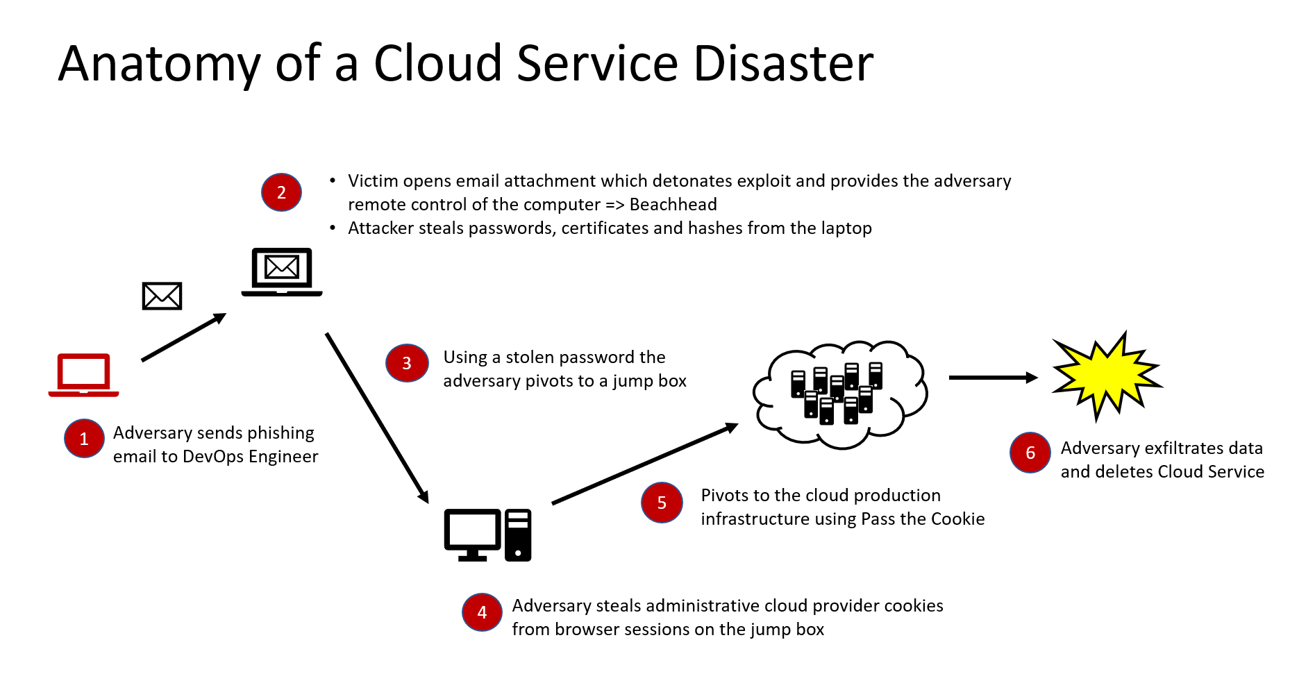
Unfortunately, there is not specific attack graph tool available to my knowledge that allows quick modeling of such a conceptual graph for an impactful presentation (with fancy red team icons). My personal to-go tool is PowerPoint for this - basically because I have used that most of the time and am comfortable with it.
I have also successfully (mis)used the Microsoft Threat Modeling tool in the past to put together attack graphs - and it worked seemingly well. Lucidchart works also, as do tools such as SnagIt. Of course, one can also use a graph database (there are 2 chapters in the book about this). In this post, however, let’s talk about PowerPoint. Adding animations is also useful when presenting and telling stories, and that’s easy todo in PowerPoint.
The scenario we are modeling
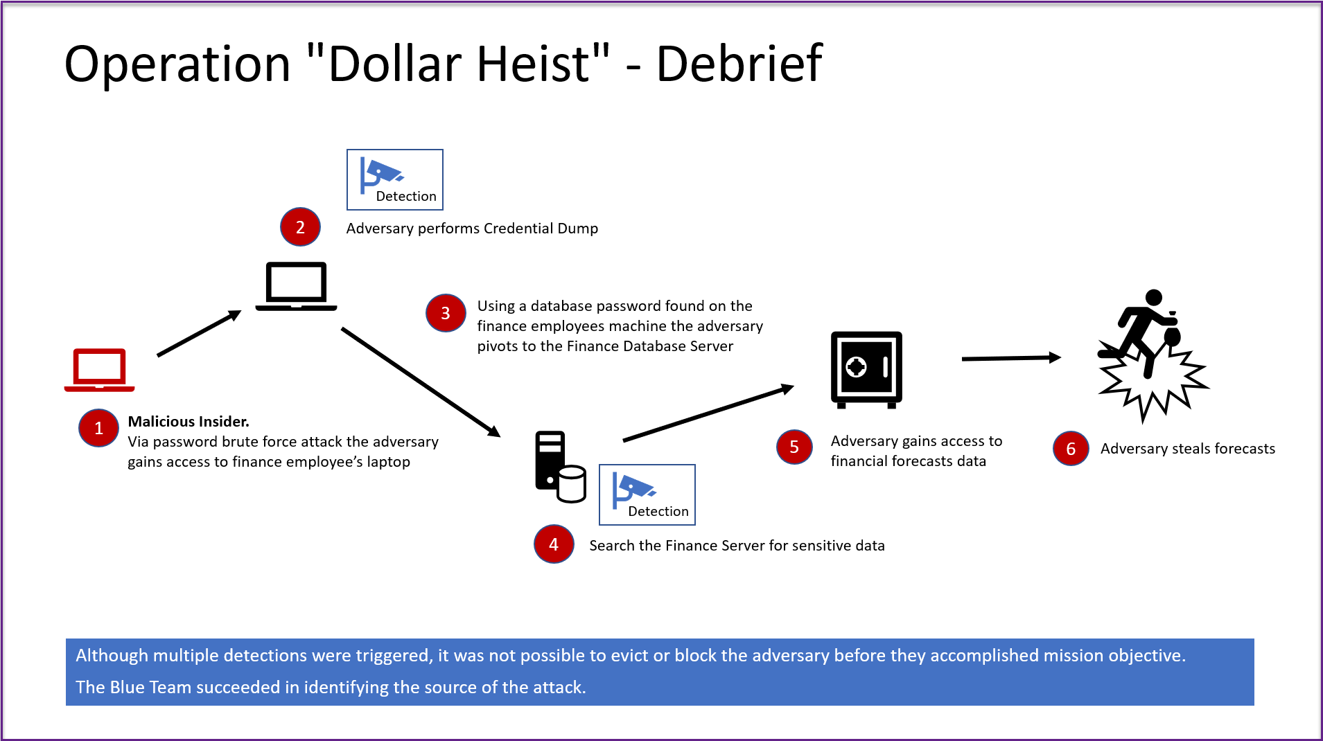
The scenario is an operation named “Dollar Heist”.
The red team was tasked to emulate an internal adversary and gain access to financial forecast information.
Explanation:
- The nifty red team emulated an internal malicious actor.
- They were so evil and guessed a local admin password to a finance employee’s laptop.
- On the employee’s machine they stole a password from (from a file on the Desktop!) .
- With that password they logged in to the finance database to look around. Yikes!
- On the server they found the financial forecast data.
- As the final step the red team exfiltrated the data.
Detections: The good thing was that the blue team had a couple of detections when these actions occured, but they weren’t able to prevent the attack. All that information can be added to a presentation, and can be made quite entertaining.
Building it using default PowerPoint icons
The icons I’m using are part of PowerPoint, you can find them by clicking “Insert” - “Icons”
![]()
There are some good icons for computers, attacks, and detection and if you want to get more fancy you can find other images on the web. Be mindful about the license of images from the web.
Animations
In order to share stories, I add animations to the graph to build up what happened and slowly provide the details of the graph step by step. With the use of animations I also never have to create many speaker notes, because the stories and information naturally comes to mind when the attack graph progresses.
Animations are good when you can speak to the graph, as it keeps the audience interested and entertained, especially if you share side stories of things that happened during the operation.
Drawbacks
These graphs are useful for discussions, presentations and also in reports when augmented with details in text form. These graphs however, can’t be automated or processed electronically easily. So, be aware of the main purpose they serve.
Downloading the templates and presentation ideas
You can find the PowerPoint presentation at the below link, feel free to use and adjust as you see fit for your own presentations:
Let me know if this is useful, and I’m also curious how others present attack graphs during debriefs.
And, if you find the information useful and like the book please leave a review on Amazon. :)
Also, feel free to follow or DM me on Twitter: @wunderwuzzi23